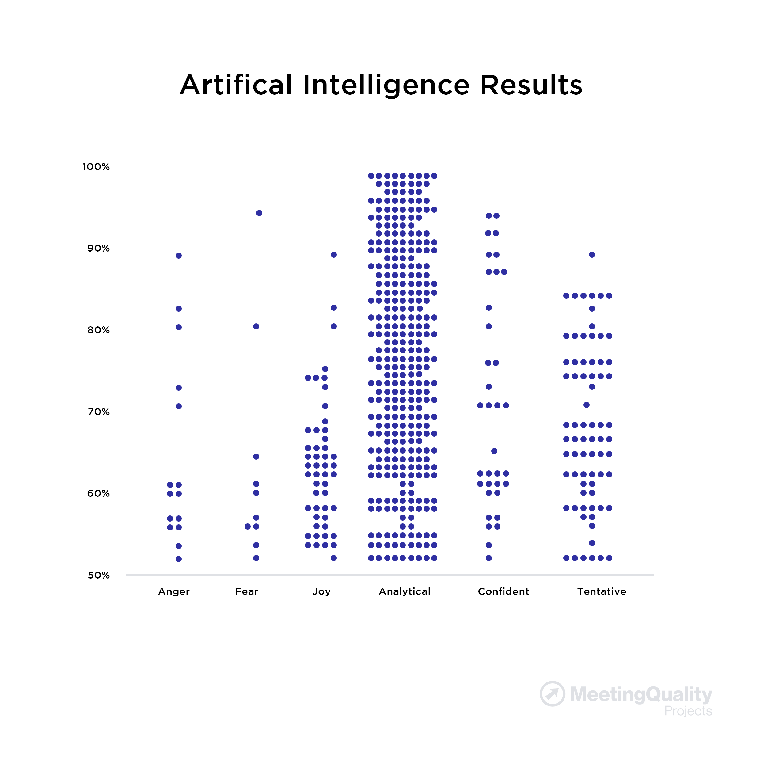
- In the left graph, each horizontal dot represents a sentence or phrase where an emotional/language tone was measured at an intensity of 50% or greater
- Dots on the vertical axis represent the cumulative intensities of each tone on a scale of 50% to 100% in a Christmas Tree-like display
- In column one (anger), contrast the 2 dots at the bottom (2 people, intensity ~ 50%) with the 1 dot at the top (1 person, intensity ~ 75%) - an very high level of anger expressed by just 1 person
- In column two (fear), contrast the 2 dots at the bottom (2 people, intensity ~ 51%) with the 1 dot at the top (1 person, intensity ~ 80%) - an extremely high level of fear expressed by just 1 person
------------------------
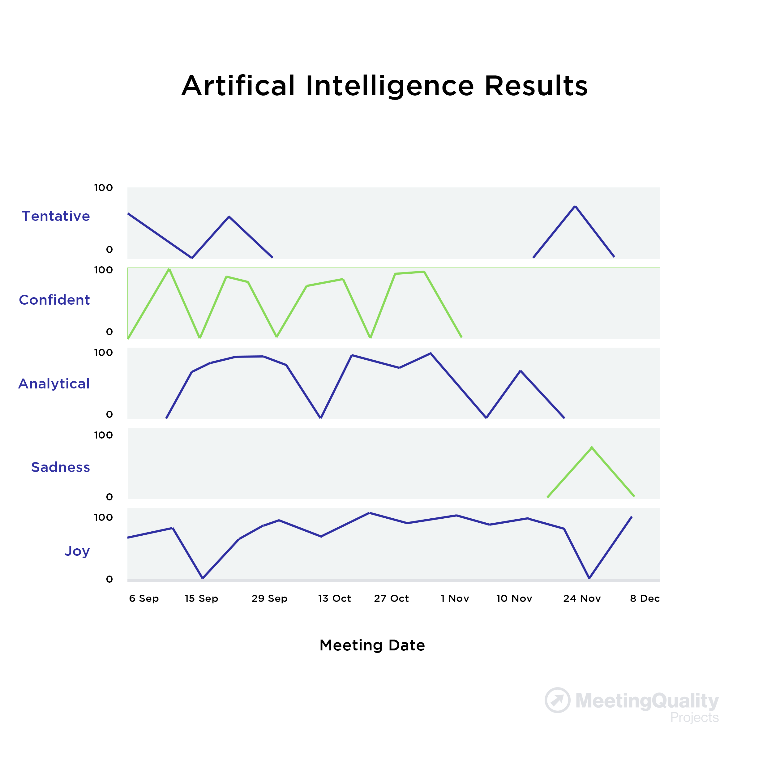
- In the right graph, each row measures the emotion/language tones over a series of meetings or MQPulse Surveys:
- Analytical, Confident & Joy tones expressed at most meetings o Sadness & Tentative tones peaked at same time that Confidence and Joy were lowest
- Tones of Fear have surfaced at the most recent meeting (this is problematic)
|