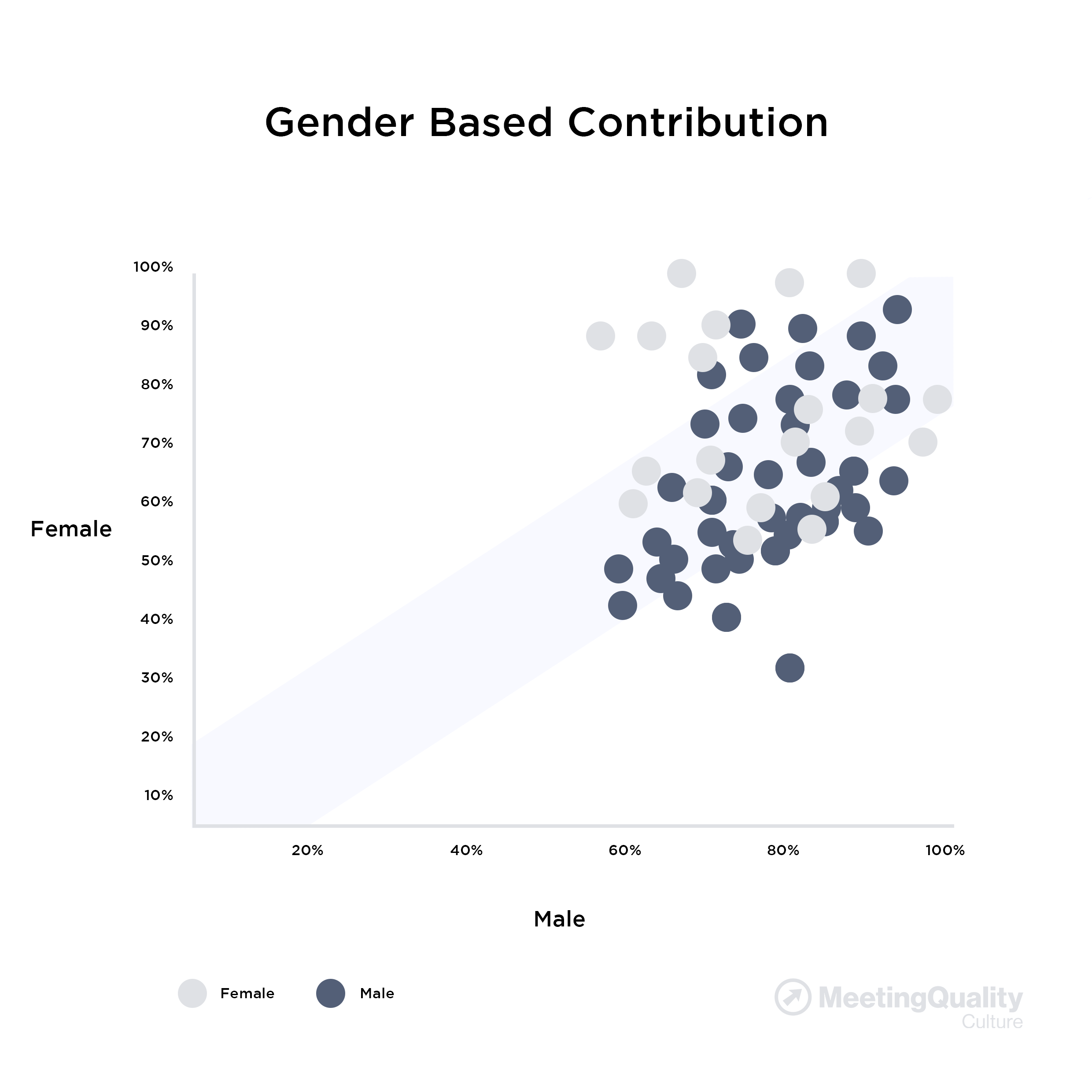
- The circle color in the sample Diversity Graph (above) represents gender types:
- light grey circles = females
- dark blue circles = males
- This gender-based Diversity Graph (above) plots the Meeting Promotor Score (MPS) graph (above) plots how:
- Female members have assessed other female's versus how they've assessed male's MPS
and
- Male members have assessed other male's versus how they've assessed female's MPS
- In this gender-based Diversity Graph, most of ratings are clustered close to the graph's "z-axis"
- However there are two outliers:
- The lowest dark circle highlights one female member who was scored at 100% by other females but only 65% by male members
- The left-most highest light grey circle highlights one male member who was scored at 80% by other males but only at 30% by female members
- That the graph shows only two outliers would indicate a non-systemic issue where a possible remedy could be new skills training for the outliers
|